Poster Research
As part of our research we had to look at horror movie posters and analyse them as well as explaining what was effective about each one. We had to do this as later we have to design our own movie poster so we want to know what is effective to include, and what is ineffective to not include.
Sample horror movie posters that are effective:
Sample horror movie posters that are effective:
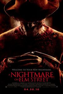
Nightmare on Elm Street
|
This movie poster for 'Nightmare on Elm Street' is effective to the audience as the red lettering and clothing represents blood and indicates that something bad is going to happen. With the hat covering the majority of the main characters face, it shows that he does not want to be known so it creates a mystery. This is effective as the audience are afraid of the unknown so creates tension. By the whole image being dark and dull, it makes it more scary to the audience as most people are most vulnerable at night/in the dark. Even though the characters face is dark, it shows the character smirking indicating that he is the villain and extremely sneaky.
We find this particularly effective as it has direct thrill to the audience through the make-up that has been used here; Freddy Krueger in the film Nightmare on Elm Street is peadophilic mass murderer and has a very unappealing appearance and this is shown through his costume and make-up design (which is also included on the poster). |
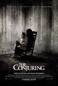
The Conjuring
|
This movie poster for 'The Conjuring' is effective to the audience as the image is black and white (including the lettering) and the blood is red, this makes it stand out. The woman sat in the chair is facing the opposite direction, so the audience doesn't know what she looks like, which again creates tension as they are afraid of the unknown. By the doll on her lap looking round with a creepy face/smile it freaks the audience out. This is effective as it makes the audience want to watch the movie to find out what how the woman has a link with the doll.
|
|
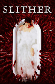
Slither
|
This movie poster for 'Slither' is effective to the audience as the woman in the bath is pure and vulnerable, as well as alone without any help. By also the bath and bubbles being white represents her being pure as well. She is being overcome by an alien plague. By this being red it represents blood which could link to her death. This indicates that she is in danger with no where to run, so is helpless. By a plague reaching her it shows that it may put others in danger as a plague can spread rapidly.
|
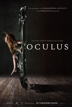
OculusIn this poster, the girl seems to be braking away from some supernatural force. The conventional colour scheme of black and white gives the poster a more traditional feel. However, the contrast of the light and dark is a type of binary opposite, representing good and evil. This poster gives a slight indication to what happens in the film with the use of the mirror shot.
The tagline is clever and reels the audience in 'you see what it wants you to see' has you thinking what 'it' is and how 'it' plays a part on this film. |
|
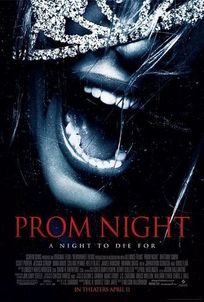
Prom Night
|
We find this effective because it is not a conventional poster; it highlights the horror a little more indirectly in comparison to how most horrors will present all of their horror through their poster whereas this one hides it in order to keep the audience gripped in.
However, horror does creep through for example - the slogan 'a night to die for' is a metaphorical twist to whats going to be contained within the film, this is a slight hint and a grip for the audience. The colours used are also counter acting with the theme of the film; the black background resembles the dark genre and the red writing represents the blood that will be shown throughout this film. The props used such as the tiara is then portrayed through the silver tone on the girl's face - this resembles the prom theme. |
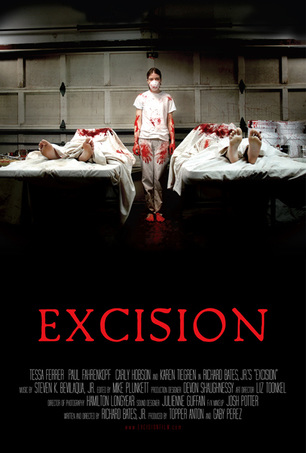
Excision
|
We find this effective as from watching the film, it gives again a direct thrill to the attended audience. The images in the poster are highly significant to relevance of the film. The image shows what actually happens in the film.
The use of white sheets in the image resembles the girl's once purity; however it is then drowned in blood- showing her progression into a horror main character. The blood is then reflected in the colour of the title 'Excision' being in a red colour is in correlation to the blood the girl has on her hands, literally. The darkness around her illustrates that everybody else is in the dark (this is then relevant to the film). The dark colours are also used to show how dark the horror genre can be. The way that the girl in the image is just stood there around all of that disruption shows that she is mentally damaged. |
|
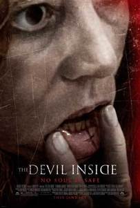
The Devil Inside
|
This poster is effective as it has direct relevance to the film; this film is based around a possession and the term 'connect the cuts' is used frequently, this has then been diverted to the poster by the image of the cross on her inner lip. This image would apply direct thrill to the audience that have also watched the film.
The slogan 'no soul is safe' being used also ties in with the possession theme and the writing being red and the patch of red in the right hand corner is associated with the blood and horror that is included within this film. The dark/black colour that is surrounding around the image of the woman indicates the darkness and grunginess of the film and sets the scene of how scary this specific horror is. |
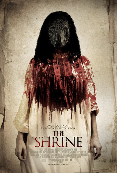
The ShrineThis poster doesn't run in theme to the ones above as it doesn't necessarily show input to the storyline. However; it is appealing in the sense that its frightening and effective, because it doesn't give away too much of the story background, it gives the graphic designer a chance to reel in the audience and if this poster appeals to them, they could then continue to watch the film too.
The slogan 'once you find it, they won't let you leave' being used its very effective as it could be seen as a metaphor behind how the audience will feel once watching this film; they will be captured into it and wont be able to leave. They've used a female in this poster, as you can see by her hair and clothing. Alongside these, the colour of her dress being white shows her purity and innocence; whereas, that then being splattered in blood can give a sneak peak to how the film ends up playing out. The dress is covered from red at the top to white at the bottom whereas the tittle 'THE SHRINE' is colour coded black at the top and red at the bottom, I believe these two have been worked in contrast of each other and show the difference between the girl herself and whatever it is that's changed her from the vulnerable girl she once was. |
|
