Question 1 - In what ways does your media product use, develop or challenge forms and conventions of real media products?
|
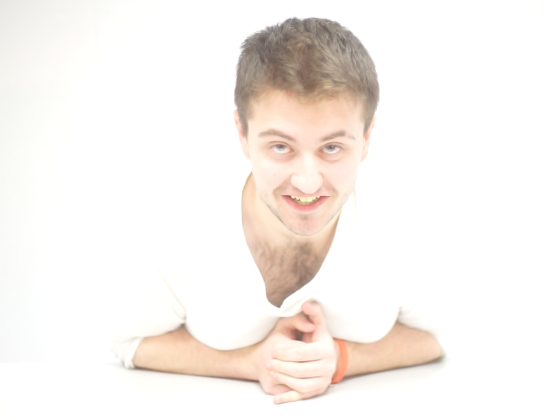
In our trailer we conformed to convention with our main girl and the other's who die. However, we challenged convention with Jade dying. Jade is a brunette, in a stereotypical horror a brunette is the one who is smart and she usually survies till the end and the blonde hair characters are those who don't survive. Within our trailer we chose females to be the victims to present the theme of vulnerability, again conforming to convention. Our predator Matt was the ideal character as he conformed to convention, he was big, nerdy and had a poor dress sense. With our idea we wanted to use someone who mirrored the appearance of the man from the human centipede which we chose Jake, however once we developed our idea Jake no longer fit the role. |
|
|
Our inspiration of 'The Call' and 'The Human Centipede' both have dominant male characters who take control and pray on females. Initially, one of our ideas was to use a female as the predator, however after we researched and watched films/tv programmes such as 'I Spit on Your Grave', 'Criminal Minds' and 'Cabin the Woods' we came to the conclusion that a female predator wasn't a pragmatic idea because other films/tv programmes that have a male role such as 'Saw', 'Prison Break' and 'The Conjuring', seem to be more successful. |


|
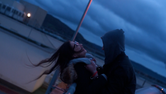
In our trailer we conformed to convention with our different settings. In an original horror there is around 8 different locations, in our horror we incorporated this to keep within the guidelines of a traditional horror. The use of a street and a car park conforms to convention because a horror will use this setting as it a typical 'safe' place due to people being around, there is the no thought that something bad could potentially happen. |
Within our trailer we used the scene shown above that was staging a mental institution. The direct contrast of the extremely bright white overlays the darkness that is shown through our trailer. We also used this technique to show the differences in our leading role's personality, the evil in him is shown throughout the trailer whilst he'd capturing his victims and this side of him shows vulnerability. We have challenged convention by doing this as usually in horrors they're all just based within dark surroundings to portray the evil and the male is usually only seen as being dominant; whereas by us showing our male role has a vulnerable side (instead of the use of a weak woman in this scene) we have completely challenged convention and done something different that we've not before seen within other typical trailers.
It is typical within an official trailer to be set in at least 8 different locations. The style of a trailer is to be a montage of clips and often not having links with one shot to another unlike an Opening Title Sequence. We stayed close to this idea in order to develop convention by filming at various locations throughout our filming days. We aimed to have a minimum of 8 locations within our trailer in order for us to do this however more would have been better.
Within horrors a typical place to film is within a small enclosed dark place to create suspense for the audience; in order to create this setting we filmed in a garage to make it seem like a dark basement.
Within horrors a typical place to film is within a small enclosed dark place to create suspense for the audience; in order to create this setting we filmed in a garage to make it seem like a dark basement.
In our trailer we filmed in various locations, street, a school, car park, basement, garage, in a field and a house. Filming in a house conformed to traditional horror as in Scream the main scenes are in a house. Other horrors that conform to our trailer are Sinister 2 where they run through a field, I Spit on Your Grave where the girl gets tortured is in a basement, a car park was in The Call and a garage in House of Wax.
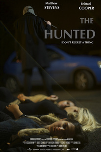
Poster

|
We used a street/road setting for our poster. Within our trailer there was a scene that was at this sort of location, therefore we applied it to our poster too.
This location was used to show how relentless our main character was by him happily killing his victims in such an open space. We thought choosing this sort of location for our poster showed that even when taking a still - the hunt still carries on no matter what location... Therefore really any location would have been suitable but we felt this would be the best to use as we could also show the car - a prop used throughout our trailer. We believe this is an iconic image in relation to our killer's personality. The location resembles the person he is and the props within the poster also give the audience a taster of what the trailer is going to be based around. |
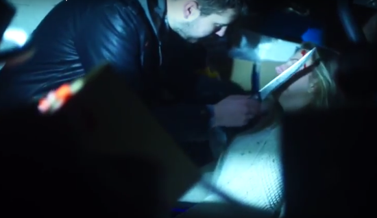
We used the Kuleshove & Collision Theory when editing our trailer. This was done to vary the pace in our trailer to conform to classic horror conventions. When using the Kuleshove and Collision theory, it allows a trailer to go from a slow pace edit to a fast past edit - this creates tension and allows the trailer to look professional as it is seen in so many traditional horrors. Within our trailer, the kuleshove and collision theory was the best idea as the beginning of our trailer was a slow paced trailer to create suspicion of our main character - then later on in the trailer the fast pace editing is what gives the trailer the character we aimed for. It is that part of the trailer that shows the true character of our killer.
Obsession
Our original idea was a man who was obsessed with young, teenage girls and he pretended to be a taxi driver in order to abduct them and take them back to where he would torture them. He would hunt different females through social media such as Facebook in order to know their whereabouts. As our idea developed we kept the idea of obsession and him stalking the girls; but instead of him being a taxi driver, we thought by using an ordinary man this would connect with our audience more as it creates a false sense of security.
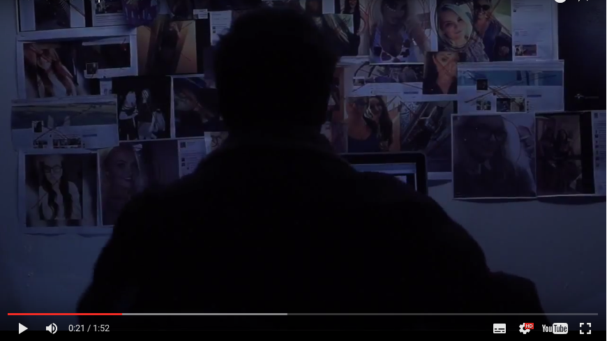
Within our trailer, we displayed obsession through Matt having a collage of girls on his wall; this was above the computer which furthered his hunt for different females. We took inspiration from each of these different films, each film has identified the key theme of obsession. We thought it would be imperative for us to mirror this into our trailer as it builds tension. Furthermore we used Matt, who is presented as a 'normal' man and commits to everyday routines, as the killer because it makes it more relatable, much like the films below.
Poster
|
We again portrayed the importance of the 'obsession' theme throughout our poster. We did this by lining up three girls that are showed as victims throughout our trailer. Showing both Matt (the killer) and the girls (the victims) the audience have an idea that our trailer is revolved around an obsession theme. |
Magazine Cover
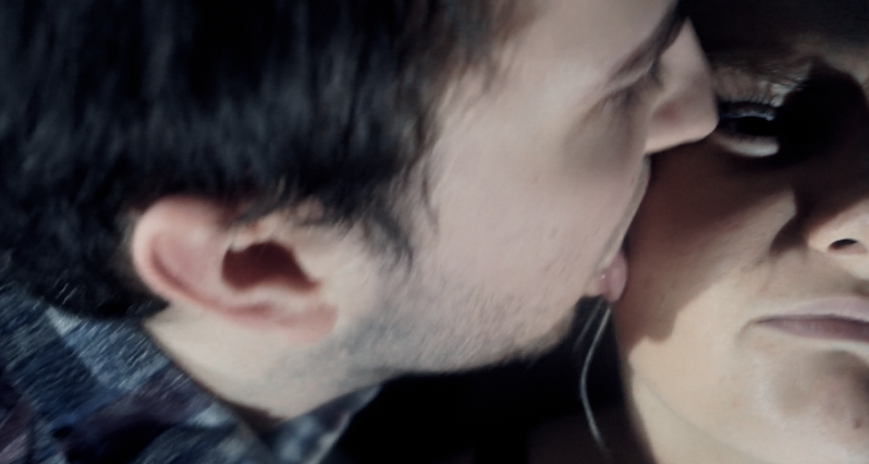
With our magazine cover we have not challenged or developed convention, we conformed to a typical horror magazine cover. We used an iconic image from our trailer where the killer licks our victims face.
We used a blonde on the front cover, which is an obvious form of us conforming to convention. With our magazine we used templates of Empire and replicated them, this then allowed our product to look like the real products.
We used a blonde on the front cover, which is an obvious form of us conforming to convention. With our magazine we used templates of Empire and replicated them, this then allowed our product to look like the real products.
